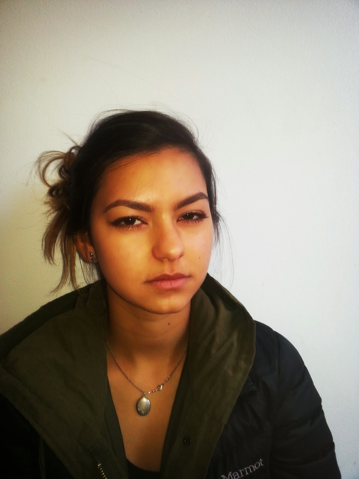
This is a collection of, in my mind, the best photos I took when trying to imitate Terry Richardson. I took 2 photos from each series.
Friday, December 13, 2013
Thursday, December 12, 2013
Richardson 3
This is the third draft of my attempts to imitate the style of Terry Richardson. I tried to get all of these models to express their characters as best they could.
Friday, December 6, 2013
Richardson 2
This is my second batch of photos where I try to mimic the work of Terry Richardson. All of my models try to have fun and express character in front of a white background.
Monday, December 2, 2013
Richardson
 |
| A subject poses with his drivers license. |
 |
| An example of people expressing their characters in a scenario. |
 |
| This subject decided to put her eyelashes up. |
 |
| Looking confused at the camera. |
 |
| He always makes this face. |
 |
| Posing for the camera. |
The purpose of this assignment was to mimic Terry Richardson and have my subjects express themselves however they so choose.
Thursday, October 24, 2013
Portraits
 |
| A model looks blankly into the camera. |
 |
| This model looks like shes deep into a story. |
 |
| I love the motion in this photo. It makes the emotion more genuine. |
 |
| This model looks a little discombobulated. |
 |
| This photo expresses genuine boredom. |
 |
| A very funny photographer took this photo. |
 |
| I loved the idea of this motion photography because I think it produces the realest emotion. |
This assignment was to mimic Richard Avedon and try to capture genuine emotion.
Wednesday, October 9, 2013
Macroworlds 2
 |
| This photo depicts a soldier about to smash an animal |
 |
| In this photo, a mountain climber rappels down a steep face of a mountain |
 |
| This is a poisonous frog in its natural habitat |
 |
| This is a giraffe in a field |
 |
| This is a mugshot of a storm trooper. |
 |
| In this picture, knights storm the gates to the home of the devil |
Friday, October 4, 2013
Microworlds
 | |
| This is a photo of a Sea God with creatures and women from his home world. |
 |
| This is supposed to be an astronaut taking his last steps on Earth before he boards a space shuttle. |
 |
| A brave knight takes on a dragon with the help only of his horse. |
 |
| This photo depicts neighborhood violence. |
 |
| This represents the life of a poacher on the job. |
 |
| This depicts ancient Egyptian life with a surreal background. The artist of the background is called Spacepainter and I used his work in the picture of the Sea God. |
Monday, September 30, 2013
Rule of Thirds
 |
| This subject represents the rule of thirds by being in one third of the photo with a blank background. |
 |
| The soup is the focus while the monsters make an interesting background. |
 |
| The high definition of the dark mesh contrasts well with the white stain. |
 |
| The blue stain is a strong focus compared to the white background and the light ring adds to the focus of the picture. |
 |
| This subject is focused on the left side of the picture and the cross of the cement adds texture to the smoothness of the ground. |
 |
| The street art shines against the black background and creates a cool effect. |
Monday, September 23, 2013
Repetition and Depth
 |
| This is the support beam of a shelf structure. |
 |
| This is the border of a doorway that creates and interesting pattern with the curve of the entrance. |
 |
| These are stacked cup lids in a coffee house that make an interesting photo with the light in the background. |
 |
| Three people on a bench in the exact same position, right down to the smartphone. |
 |
| A fence that separates the street from the front door of an apartment building. |
 |
| A shoe with an interesting stitching pattern that curves out of view. The material of the shoe gives the image a soft texture that warms up the rest of the image, even through the black and white. |
This assignment was to capture repetition and depth.
Subscribe to:
Comments (Atom)


